The single most important thing to think about when crafting your website or blog — is not how beautiful it is but how well it functions as a lead generation machine. Probably the single biggest mistake companies and people make when crafting a website is that they focus entirely too much on the physical beauty of the site. Does it look cool? Does it make them look smart? Does it make them look sexy, or up to date, or high end or any of a host of attributes that they want to associate with their brand or company? In an age of The Invisible Sale — I think we have to see our websites in a new light.
Form Should Follow Function
Don’t get me wrong, I’m not saying that visual aesthetics are not important in web design, but I am saying that form should follow function and not vice a versa. Contrary to popular belief, your website is not an ad. And while the visually aesthetic nature can add or detract from brand perception the fundamental role of your website is not to brand your company. The fundamental role of your website is to serve as the ultimate salesperson.
And the first step in making that dream a reality is to make it very easy for a prospect to research your offerings or in the case of a company like mine — a digital marketing agency — your thinking and your services. When people arrive at your site, don’t make them guess what you do or how you can help them.
Tell them in plain, simple words and icons. Give them a chance to start sending you buying signals based on the content they consume.
Fixed Sales Funnels
Before you design your site, spend time and energy focusing on your key sales offerings. What do you sell and how can you make it easy for your prospect to find and then descend into sales funnels based on the site content? Scroll back up to the image at the top of this post. That’s what fixed funnels look like.
When a prospective client arrives at my site they instantly see the three key offerings — Digital Strategy, Sales Prospecting and Digital Briefings. Those are the three key services that we sell. And if they elect to enter any of those three funnels they are immediately presented with content that is designed to push them farther down the funnel towards a contact form.
However, and our Google Analytics bear this out, very few, especially first or second time visitors, stay in those fixed funnels. It makes sense when you think about it — they’re not yet familiar with us. They want to learn more about us and thus they pop back out of the fixed funnels to explore and poke around a bit.
So we have designed a second set of funnels.
Dynamic Sales Funnels
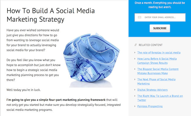
If you read a blog post or visit a service description page you’ll be given an easy way to continue exploring content on our site. It’s called Related Content and we manually select and map those links for every page on our site.
So here we have a Social Media Strategy post and to help draw a reader down the digital strategy funnel, we offer up other social media posts. But you’ll notice that we mix in tactical posts like How to Launch a Brand On Twitter with forward looking posts like The Next Phase of Social Media Marketing and finally, we give the reader a chance to pop into one of those fixed funnels with a link to our Digital Strategy Advisors page.
This is a pretty simple example. There are others on the site that involve a far more complex dynamic funneling approach but this one should give you enough to get your mental gears going.
The Benefit of a Funnel Optimized Website
Leads. More of them. Better qualified and easier to close.
You read a lot about creating sticky sites. But this isn’t about sticky for the sake of sticky. No, funnel optimized websites provide you with far more back-end data about your visitors. Data that you and your sales team can use to reduce your sales cycle and increase your conversion rates.
Got a question you’d like to ask about Funnel Optimized Websites — click here and we’ll get back to you ASAP with an answer.


Thanks for finally writing about >Web Design Strategy:
How To Create Funnel Optimized Websites <Loved it!
Good job. I hope to have your expertise one
day. I’d like to find out more, design forward to hearing from you.
I agree. I coined a term a while back regarding this concept; “neuro-gyn-nomical”.
Hi there, just wanted to say, I enjoyed this blog post. It was practical.
Keep on posting!
Wonderful site you have here but I was wondering if you knew of any forums that cover the same topics discussed here?
I’d really love to be a part of online community where I can get comments from other knowledgeable people that share the same interest.
If you have any suggestions, please let me know.
Thanks!
Sweet blog! I found it while browsing on Yahoo News.
Do you have any tips on how to get lisged in Yahoo News?
I’ve been trying for a while but I never seem to get there!
Thanks
Superb blog and outstanding style and design.
Hey! This is my first visit to your blog! We are a collection of volunteers and starting
a new project in a community in the same niche.
Your blog provided us beneficial information to work on. You have done a outstanding job!